Intro
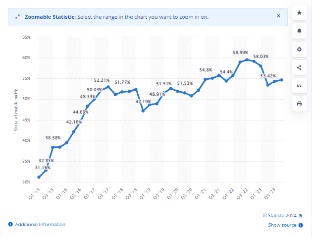
The use of mobile phones is responsible for approximately half of the total global web traffic. According to Statista, in the last quarter of 2023, 58.67% of total website traffic was just from mobile devices worldwide. This data indicates that websites not optimized for mobile devices may lose half of their web traffic. Thus, creating a responsive website has become necessary for mobile devices.

Creating a responsive website is how to meet user expectations and enhance the user experience with the website. Hence, there is a great demand for responsive websites by users, and most organizations aim to develop such websites using responsive design.
In this article, we will discuss the best practices that can be used by developers for creating responsive websites. It will give tips for building a website that functions perfectly on different screen sizes and devices. We will also discuss how to test site on mobile devices to ensure responsiveness.
So first, let us have a good understanding of responsive websites.
What Does a Responsive Website Mean?
A responsive website is a site that automatically detects the user's device and adjusts its layout accordingly to provide an improved user experience. These websites usually change their appearance and interactive features based on the device and screen size used. Responsive Web Design (RWD) lies at the core of such sites, which ensures that pages adapt to the user's screen size.
The All-in-One Platform for Effective SEO
Behind every successful business is a strong SEO campaign. But with countless optimization tools and techniques out there to choose from, it can be hard to know where to start. Well, fear no more, cause I've got just the thing to help. Presenting the Ranktracker all-in-one platform for effective SEO
We have finally opened registration to Ranktracker absolutely free!
Create a free accountOr Sign in using your credentials
RWD uses CSS to give diverse style features like fonts, images, and menus, depending on factors like device type, screen size, orientation, colors, and other device features. CSS also enables optimal utilization of the device's viewport, the visible area on the screen, and media queries, enabling web pages to adjust based on viewport width and website layout.
The main goal of a responsive website is to offer a consistent user experience across all devices, minimizing the need for zooming or scrolling. It streamlines navigation, reducing confusion and enhancing overall user satisfaction.
Best Practice for Creating a Responsive Website
Creating responsive websites requires using several best practices that ensure they function well across different devices and screen sizes.
Here are some of the best practices:
Mobile-First Design
Mobile-first design, or the mobile-first approach, allows web designers to initially start website design focusing on mobile devices. This typically involves sketching or prototyping the web app's design for the smallest screen first and gradually progressing to larger screen sizes.
Emphasizing design for mobile devices is logical because smaller screens have space limitations. Teams must ensure that the essential elements of the website are prominently displayed for users on these screens. By initially designing and developing for small screens, designers are compelled to remove anything unnecessary to create seamless website rendering and navigation.
Determine Suitable Responsive Breakpoints
Within the responsive design, breakpoints indicate when a website's content and design adjust to optimize user experience. You must establish the "responsive breakpoints" or screen size thresholds when working with media queries. A breakpoint represents the screen width where you utilize a media query to apply new CSS styles.
Typical screen sizes include:
- Mobile: 360 x 640
- Mobile: 375 x 667
- Mobile: 360 x 720
- iPhone X: 375 x 812
- Pixel 2: 411 x 731
- Tablet: 768 x 1024
These points are specified within the code. Website content reacts to these points, adapting to the screen size to present the appropriate layout. By establishing CSS breakpoints, website content could align with screen size, enhancing visual appeal and ease of use.
Start With a Fluid Grid
A responsive website should be built on a fluid grid. The website uses a fluid grid to develop adaptable layouts using relative units such as percentages or ems rather than fixed units like pixels. It divides the page width into multiple equally sized and spaced columns, with page content arranged based on these columns.
As the viewport widens horizontally, each fluid column expands proportionally, along with its content. This enables web page elements to resize relative to one another based on the screen size or device. Thus, it allows the positioning of web elements in proportion to the screen size.
Clickable Area Dimensions
Depending on your website's purpose, you might have various buttons, menus, or clickable elements. In responsive web design, a crucial consideration arises: What should the size of my buttons be?
The All-in-One Platform for Effective SEO
Behind every successful business is a strong SEO campaign. But with countless optimization tools and techniques out there to choose from, it can be hard to know where to start. Well, fear no more, cause I've got just the thing to help. Presenting the Ranktracker all-in-one platform for effective SEO
We have finally opened registration to Ranktracker absolutely free!
Create a free accountOr Sign in using your credentials
Designing buttons and menus for desktops is easy because we use a mouse to click. The mouse pointer is small, so even small buttons are easy to click. However, the screen size of mobile devices is comparatively smaller than desktops, and the button must be large enough to tap with fingers. So, it is important to consider the area dimensions of buttons when creating a responsive website. It is always preferred to have a 60-pixel button size with a range between 42 and 72 pixels.
Consider Touchscreens
When considering how to achieve website responsiveness, consider touchscreens. Ensure navigation menus and interactive elements are easily accessible for touchscreen users, using larger tap targets and adequate spacing between elements to prevent accidental taps.
Use Typography
For creating a responsive website, the use of typography is considered one of the best practices as it allows for quick information absorption. It is the process of using diverse fonts and structuring the letters and words in a way that helps in readability and even navigation. You should use highly legible fonts, particularly for crucial text elements like navigation labels. You can adjust the size based on font design, preferably using the em unit of measurement, starting from 1 to 1.25em. Also, avoid excessive spacing that leaves text disjointed or too little spacing that causes words to bunch together.
Add Call-To-Action Buttons
A call-to-action (CTA) has significant importance on any webpage. Clear CTAs in links and buttons help direct users where to proceed, preventing confusion regarding purchases or program sign-ups.
When creating a responsive website, you must ensure your CTA button highlights the pages through its colors, style, size, and shape. Using recognizable shapes like circles, squares, and rectangles is preferred to avoid errors or misleading navigation. Stick to familiar button shapes to maintain clarity. Additionally, consider the button size's impact on user recognition and clickability, especially for touchscreen devices. Provide ample space around important buttons and text links to minimize accidental clicks.
Implement Scalable Navigation
Maintaining user-friendly navigation across different website versions is important. Scalable navigation adjusts menu and navigation bar placement to prevent them from being hidden or difficult to access on smaller displays. When simplifying navigation for mobile devices, prioritize displaying options that most users need to access.
Utilizing SVG and Responsive Images
Logos and images for your website can be challenging to design. You aim to incorporate high-resolution images that maintain clarity regardless of user zoom. However, high-resolution images often lead to longer loading times, impacting SEO. Ideally, your site should load in under 2 seconds. While reducing image resolution may speed up loading, it compromises image quality upon zooming. So, what's the solution?
The solution lies in scalable vector graphics, commonly known as SVG images.
Unlike pixel-based images, SVGs are composed of mathematical equations represented in XML format, defining lines and curves to create graphic shapes. These images are scalable and compatible with most major browsers. They retain clarity regardless of zoom level, as they never pixelate. Editing them is straightforward using tools like Sketch or Adobe Illustrator. Additionally, their colors can be modified using CSS or JS. SVG files are minimal, allowing you to create banner images that only occupy a few KBs. Moreover, since they are defined in XML, search engines can easily recognize descriptions and keywords, making them SEO-friendly.
Test Responsiveness on Device Viewports
When creating a responsive website, testing it on real devices should not be overlooked. It is important to verify and validate the responsiveness of websites and evaluate their appearance across different real devices. You can opt for responsive testing tools like LT Browser to test responsiveness on mobile viewports.
Tools like LT Browser offer 53+ pre-installed device viewports for Android, iOS, desktops, and laptops. Using this, developers and testers can perform mobile website testing at scale while leveraging complementary features of LT Browser, such as developer tools, hot reloading (for React apps), generating Lighthouse reports, checking website performance, and more.
Cross-browser testing
Responsive websites should undergo cross-browser testing because users mostly depend on different devices and browsers to browse the internet. Have you ever considered how a potential user would react if they encountered glitches or horizontal scrolling issues on your website while viewing it on their mobile device? They might easily switch to your competitor's site without a second thought. Hence, it's essential to address the following aspects. Thus, ensure your website displays correctly on all devices and browsers with different resolutions.
The All-in-One Platform for Effective SEO
Behind every successful business is a strong SEO campaign. But with countless optimization tools and techniques out there to choose from, it can be hard to know where to start. Well, fear no more, cause I've got just the thing to help. Presenting the Ranktracker all-in-one platform for effective SEO
We have finally opened registration to Ranktracker absolutely free!
Create a free accountOr Sign in using your credentials
During development, avoid using frameworks or libraries known to cause bugs in specific browsers. Setting up a physical device lab and test environment in your office can be challenging. Cross-browser testing in the cloud offers a simple and convenient solution without worrying about local infrastructure. With LambdaTest, you can seamlessly test your website across a wide array of browsers running on the cloud with just a few clicks. It provides a scalable cloud grid and is regarded as one of the top cross-browser testing tools.
LambdaTest is an AI-powered test orchestration and execution cloud-based platform that allows manual and automation testing on 3000+ real devices, browsers, and OS combinations. Simply input the website URL, choose test configurations, and the platform will display how the site appears on multiple devices, including iPhone 11, iPhone 8 Plus, Galaxy Note 20, Galaxy S9 Plus, and more.
Moreover, LambdaTest supports automated testing with frameworks like Selenium, Cypress, Playwright, Appium, Espresso, XCUITest, etc.
Conclusion
Developing a responsive website involves thoroughly planning design, development, and optimization strategies to guarantee an excellent user experience on different devices. Developers can create websites that adjust smoothly to various screen sizes and resolutions by prioritizing performance optimization, utilizing media queries, implementing fluid layouts, and adopting a mobile-first approach.
Furthermore, adding touch-friendly navigation, flexible typography, and following accessibility standards improves usability and inclusivity. Consistent testing and continuous improvements are essential for ensuring stability and performance across the constantly changing array of devices and browsers. Ultimately, adhering to these recommended techniques allows for developing websites that effectively captivate users in the current multi-device digital landscape.

