Intro
What is Soft UI? 8 Tips For Web Design Beginners
Those who are beginning their fast-paced career as a web designer will need to understand the importance of keeping up to date with emerging design trends, especially those that impact the user.
User interface (UI) designs should be easy to use and visually pleasing, as this can determine whether a website visitor has a positive experience with a brand.
With technology evolving fast, UI design trends include interactive 3D objects, spatial design, feature showcasing, VR and AR, bento grids, and soft UI design.
In this article, we deep-dive into one of the trends that has gained traction in recent years and can not be overlooked—soft UI design. We will explore eight tips for web design beginners who want to jump on the neomorphic design trend in 2024 and four of the main struggles when using a soft UI design.
What is Soft UI?
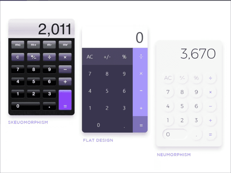
Soft UI, also known as neumorphism, sees designers add depth and dimension to elements by using highlights and shadows to make them appear slightly raised from the screen.
Neumorphism merges the visual appeal of skeuomorphism and the simplicity of flat design to create a modern, minimalistic look.

The All-in-One Platform for Effective SEO
Behind every successful business is a strong SEO campaign. But with countless optimization tools and techniques out there to choose from, it can be hard to know where to start. Well, fear no more, cause I've got just the thing to help. Presenting the Ranktracker all-in-one platform for effective SEO
We have finally opened registration to Ranktracker absolutely free!
Create a free accountOr Sign in using your credentials
(Image Source: Toptal)
Even Apple jumped on the bandwagon when it introduced various soft UI style changes to both its mobile and desktop operating systems. Let's find out why by taking a look at some of the benefits of using neuromorphic design:
- Modern look. Neuromorphic designs can give your website a more modern look because it is one of the latest trends in UI/UX design.
- Engaged users Neuromorphic designs make elements feel more engaging to your website visitors because the shadows and highlights make them appear to pop out of the screen.
- Improved readability Neuromorphic designs can improve readability because the high contrast between the text and the background colour makes the text easier to read.
This web design trend works well for brands that want their apps, operating systems, and websites to feel friendly and informal.
8 Soft UI Design Tips For Beginners
Use shadows and highlights
Shadows and highlights can add depth, dimension, perspective, and realism to a design element, making it seem 3D. Users are more drawn to the information when an element seems to pop out of a screen.
In addition, adding shadows and highlights to elements can create a visual hierarchy. The elements with larger, deeper shadows appear closest to your website visitors, so they stand out more. This is how you show users the most important piece of information on the page.
Use a subtle colour palette
Blue is without a doubt one of the best and most frequently used colours in UI design. Think of popular app icons such as Facebook, Safari, PayPal, Prime Video, and Shamaz, which all use shades of blue with white.
However, for the perfect neomorphic design, the colours used should create a calming effect, so it's best to avoid bright colours and instead use a soft, low-saturated colour palette with subtle variations in shade.
Colours such as khaki, brown, taupe, white, ivory, beige, and grey can work perfectly for a soft UI design.
Use smooth gradients
Using gradients adds depth to elements, which is the aim of a soft UI design.
A gradient is the gradual blending from one colour to another. Ideally, you'll need to choose colours from the same soft palette, just toned down or brightened, depending on the effect you are trying to create.
The All-in-One Platform for Effective SEO
Behind every successful business is a strong SEO campaign. But with countless optimization tools and techniques out there to choose from, it can be hard to know where to start. Well, fear no more, cause I've got just the thing to help. Presenting the Ranktracker all-in-one platform for effective SEO
We have finally opened registration to Ranktracker absolutely free!
Create a free accountOr Sign in using your credentials
The gradient needs to be hardly visible but just enough to make the design element stand out by adding a new dimension to it.
Use neuromorphic designs sparingly
A neuromorphic design is great for ensuring a specific element stands out to website visitors.
However, you don't swamp your screen with gradients, highlights, and shadows because if you add a soft UI design to every element, you won't be able to draw attention to the most important ones.
In addition, too much soft UI design can make your website look cluttered and unprofessional - removing the clean, minimalistic look designers are aiming for.
Avoid images
Neomorphic designs can make an element look 3D, so avoid adding this to images on your webpage. They don't fit the style and will break the illusion.
Instead, use diagrams and illustrations with soft UI designs for a more consistent look.
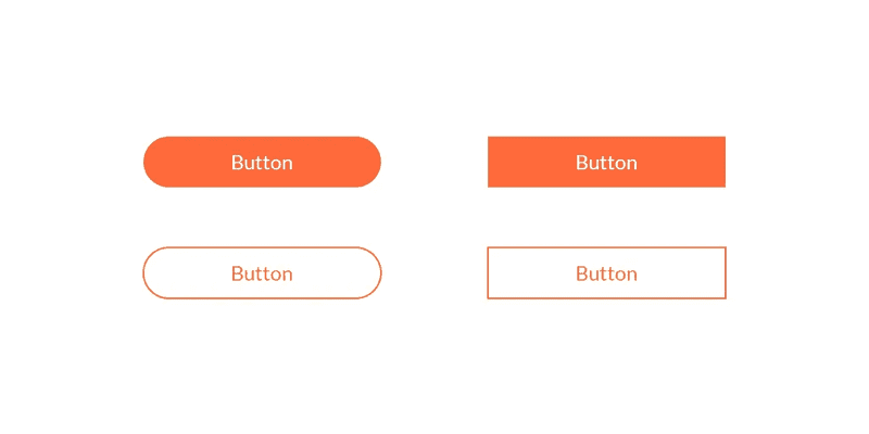
Use rounded corners
Sharp edges make the interface serious and formal, which is not the aim of a soft UI design.
Curves are often smooth and do not pose a risk of injury, so rounded corners are psychologically related to safety, approachability, and friendliness.
Even on a computer or laptop screen, the human brain prefers a rounded shape. Try using rounded corners to create a more gentle and friendly appearance overall.

(Image Source: Logic Design)
Choose text colours wisely
Adding a little bit of your chosen background colour into your design elements via the text is an excellent idea.
For example, if your text is green and your background is grey, put some parts of the text in grey for a visual appeal.
However, you may want to choose a more contrasting colour if your aim is to make the information in the design element stand out.
Experiment
Finally, proper experimentation is the key to unlocking the benefits of soft UI design.
UI design trends can't focus exclusively on looks because usability is always an essential part of website design ideation. So, web designers will need to experiment with creating soft UI design elements in a way that doesn't compromise usability.
4 Struggles With Soft UI
Not accessible for those with low vision
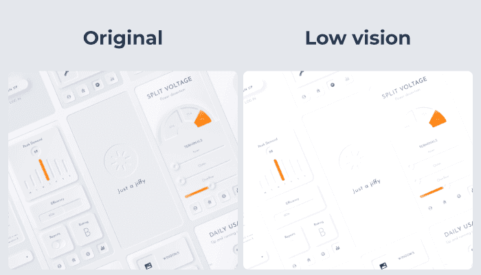
A soft UI design looks visually pleasing for people with great vision. However, users with low vision might not see the same benefits and instead see crucial design elements disappear into the background.

(Image Source: svgator)
Not accessible for those with low-quality screens
On the other hand, your website visitors don't necessarily need vision problems to struggle with neomorphism.
The All-in-One Platform for Effective SEO
Behind every successful business is a strong SEO campaign. But with countless optimization tools and techniques out there to choose from, it can be hard to know where to start. Well, fear no more, cause I've got just the thing to help. Presenting the Ranktracker all-in-one platform for effective SEO
We have finally opened registration to Ranktracker absolutely free!
Create a free accountOr Sign in using your credentials
The design is all about softness, which causes elements to almost blend together, so those using devices with low-quality screens might also struggle to see the elements.
CTAs don't attract clicks
Another major struggle, this time for brands and not the users, is that the subtlety of neomorphism can lead to problems with attracting clicks and conversions.
For call-to-actions (CTAs) to work, users need to notice the design instantly. However, neomorphism is soft on the eyes, with little colour contrast and few colour pops. This means that CTAs don't stand out as much as they should, and visitors are less likely to convert.
Buttons don't stand out
Usability is the most important consideration in any UI design. However, when you focus on creating soft, subtle elements for your interface, usability sometimes suffers.
Buttons can almost blend into the background, which means visitors aren't dragged towards the buttons that matter the most when navigating your website.
More Than Just A Design Trend
In conclusion, soft UI design is more than just a trend; it bridges the real and online worlds.
However, it's essential for web designers of all levels and skills to recognise the benefits and the struggles of neomorphism before adding it to their toolkit.

