Intro
Most businesses own a website with an eye toward using it to increase revenue, whether that’s driving customers to a physical store, getting them to call for follow-up, or even purchasing a product online. Yet, many websites fail to deliver on the goals the website owner sets, especially when the business is small since many small businesses lack the expertise necessary to optimize the user experience to generate the greatest conversion rate possible. Today, I offer some tips for improving your brand’s conversion rate by improving the user experience.
What is User Experience (UX)?
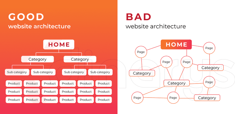
User experience reflects how visitors interact with your website once they arrive at your page. A bad user experience results in confused customers who don’t understand how to access the information needed due to elements such as poor page structure (see image below), unclear navigation, slow load speeds, poor image quality including too many stock images, buttons too close together (especially on mobile devices), and old content.
Although written from the perspective of e-commerce sites, this image compares a good website architecture with a bad one.
In contrast, a good user experience is the opposite, with the addition that a good UX involves content that’s original and fulfills a need for visitors. Note the importance of the user or visitor in interpreting the experience, a topic we’ll return to a bit later.
UX encompasses all aspects of a user's interaction with a website, including the design, navigation, content, and overall usability. In today’s internet, that also means providing for users with different abilities, such as using devices to help with poor vision (i.e., using alt tags to define images).
How to Achieve a Good User Experience
While design is an important element of a good user experience, it’s only one aspect and, when it comes to conversion rate optimization, it isn’t even the most critical part of the user experience. In my experience, UX is a step-by-step process for designing a website. So, next, I’d like to explain my vision of this process and the overlap between a good UX and conversion rate optimization.
1. What is my brand?
Unless you understand your brand and what it should stand for to your target market, I don’t think you can truly design a user experience that works for them.
Like many marketing consultants working in digital marketing, I have designed a multitude of websites for clients and currently run a few for myself. My major website is Market Maven where I share insights to help small and medium-sized businesses that want to succeed in digital marketing. Each website has its own personality because the product and market are different. For instance, on Market Maven, the tone is friendly but authoritative, involving several authoritative backlinks within my content and focusing on marketing concepts to demonstrate that I’ve done my homework. A website for a client that offers dog walking services is much more focused on local events of interest to pet owners and images of pet clients rather than sounding slightly academic.
The All-in-One Platform for Effective SEO
Behind every successful business is a strong SEO campaign. But with countless optimization tools and techniques out there to choose from, it can be hard to know where to start. Well, fear no more, cause I've got just the thing to help. Presenting the Ranktracker all-in-one platform for effective SEO
We have finally opened registration to Ranktracker absolutely free!
Create a free accountOr Sign in using your credentials
Successful website design involves understanding your brand and then portraying that brand in a favorable way to your target market. Once you have that clearly articulated, you can choose a theme and lay out your site.
2. Layout your website
As you can see from the image shared earlier, you need to determine the architecture for your website. Sometimes, small businesses choose a one-page website, which I think is a mistake. If you don’t believe me, Google it; nearly every SEO company agrees.
From a UX perspective, a single page severely limits the amount of information you provide visitors and makes it challenging for visitors to navigate the website effectively. Website builders like Wix and Squarespace often promote one-page websites as they require less storage space. But don’t get me started on the dangers inherent in website builders or we’ll be here all day.
Different pages of your website require a different layout. For instance, your home page might use a design that looks something like this:
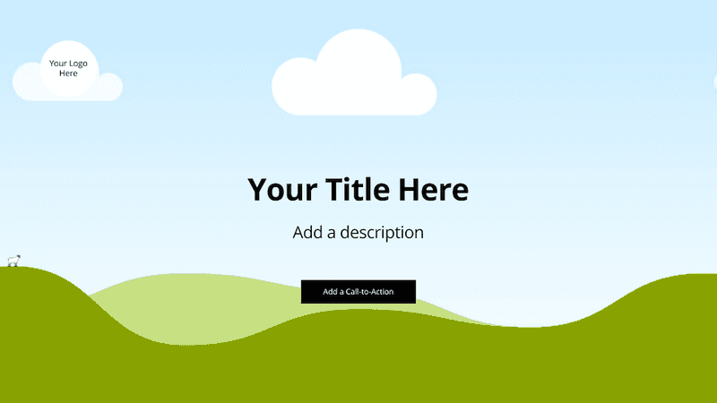
Obviously, you should add an image in the background that resonates with your target market, your logo, and a description that defines what you do in a very short sentence. For instance, on my page, I use an image showing how various aspects of marketing fit together to generate success. My description is: “Data-Driven Marketing: High-growth businesses need a customized solution and we’ve got you covered”. The Call to Action takes you to our services page, a landing page.
A landing page requires something that looks more like this:
The All-in-One Platform for Effective SEO
Behind every successful business is a strong SEO campaign. But with countless optimization tools and techniques out there to choose from, it can be hard to know where to start. Well, fear no more, cause I've got just the thing to help. Presenting the Ranktracker all-in-one platform for effective SEO
We have finally opened registration to Ranktracker absolutely free!
Create a free accountOr Sign in using your credentials
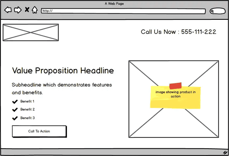 Image from Balsamiq
You must provide motivation for visitors to learn more about your product (whether it involves goods or services). Choose something that sets you apart, something valued by visitors as a way to differentiate your brand from the competition.
Make the landing page compelling and easy to skim.
3. Write content
Producing valuable content on a consistent basis is the single biggest factor in SEO (search engine optimization) and, frankly, if folks never find your website because your low SEO rank means you show up on page 10 or later, why bother having one? This need for valuable content implies adding a blog page (pages) to your website. Recognize that quality content trumps quantity when it comes to SEO. These posts establish the credibility of your brand, offer users insights on how your brand solves their problems, show usage suggestions, and offer helpful tips. For instance, King Arthur Flour soared against the competition by adding a recipe section to its website. The pandemic allowed their efforts at building community to pay off as more folks got into bread baking.
Not only do these posts improve your rank in search engine results by demonstrating that your content deserves more traffic, it helps convince your market that your products are right for them by implying credibility.
Hence, the first step toward conversion rate optimization is to create content that’s optimized for SEO using both on-page and off-page SEO ranking factors.
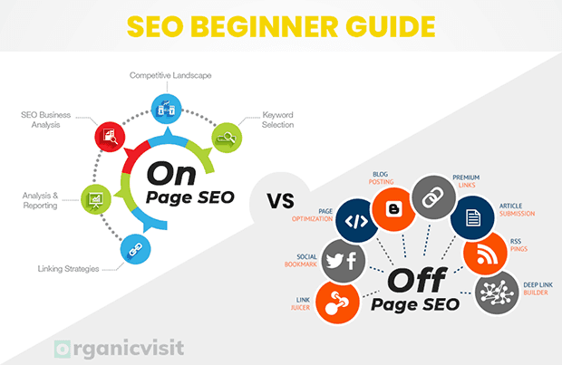
At the same time, consider your target market and what they need to hear from you. For instance, on my blog, I write about things like how to create a website yourself, how to interpret Google Analytics, and how to incorporate marketing concepts in your marketing strategy. These topics are of little interest to big businesses or individuals, but they’re critical for small businesses that often lack skilled marketing staff.
Write what you know, what your market needs to hear, and do it well with good spelling, grammar, and organization, which includes appropriate headlines, sub-headlines, and bullet points.
4. Reduce traction in your conversion funnel
The average conversion rate for an e-commerce store is only between 2.5% and 3%. That puts a lot of pressure on your brand to optimize your conversion rate as much as possible if you want to succeed.
The All-in-One Platform for Effective SEO
Behind every successful business is a strong SEO campaign. But with countless optimization tools and techniques out there to choose from, it can be hard to know where to start. Well, fear no more, cause I've got just the thing to help. Presenting the Ranktracker all-in-one platform for effective SEO
We have finally opened registration to Ranktracker absolutely free!
Create a free accountOr Sign in using your credentials
A good UX contributes to higher conversion rates because visitors can find the content that motivates them to make a purchase more easily and the content flows toward conversion. But CRO (conversion rate optimization) doesn’t stop there. Consider your conversion funnel using the graphic below.
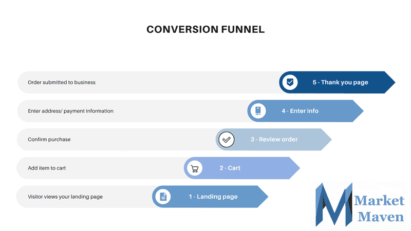
Thus, you should spend significant effort to reduce any stickiness in your conversion funnel, so the maximum number of visitors flow through the funnel to the thank you page, representing a sale. While this might sound obvious, shopping cart abandonment rates average 70% (the midpoint in studies between observed values of 56% and 81%). Potential customers might leave your landing page without making a purchase if the information provided isn’t accurate or sufficient to make a purchase decision. For instance, when shopping for a wedding dress, consider the most important decision variables such as price, length, color, and material so you can provide filtering that reduces the cognitive load in making a decision. Try to display no more than 15 options according to a study by Caltech.
Among the factors contributing to shopping cart abandonment are:
- High shipping costs
- Unexpected charges or higher price than expected
- Forced to create an account
- Limited payment options
- Website security concerns
Try to streamline your conversion funnel by removing unnecessary steps to increase the conversion rate. For instance, Amazon offers a 1-click conversion for registered users, resulting in higher conversion rates.
5. Improve CRO
Don’t just accept a low conversion rate or assume you’ve done enough to optimize your conversion rate. Here are some elements you should use to improve your conversion rate.
- A/B Testing: Compare two or more web page versions to determine which performs better in conversions. To find the best option, test the elements that impact conversion most. Here are some places to start:
- Call-to-action (CTA) Optimization: Ensure CTA buttons and messages are clear, compelling, and strategically placed. Test different colors, sizes, and positions for your CTA and different wording.
- Headline
- Offer, for instance, I found a big difference between offering a free booklet versus another free item of the same value in terms of conversion rate.
- Layout of the landing page
- Benefits highlighted on the landing page
- Tracking: Using tools like Google Analytics is critical for improving your performance. By creating dashboards containing key performance indicators, you have daily tracking of your performance to monitor improvements over time. You can also dig deeper into your analytics to determine which pages are over/underperforming, which target market groups convert at a higher/ lower rate, which products perform best, where visitors drop off in the conversion process, and which tactics generate higher/ lower conversion rates.
- Remarketing: This is a tactic for reaching back out to prior visitors on social media or using search ads. Remarketing ads can generate up to a 50% conversion rate.
- Use a lead generation program: These programs usually involve email marketing to prior visitors. Because they already showed an interest in your products, following up with prior visitors using a sequence of email messages personalized to their interests and where they are in their customer journey generates a high return.
- Build a community: By creating a community on social platforms, you encourage users to visit your website and share your content with their own social networks to increase awareness of your brand and drive visits to your website. Users find other users much more credible and are more likely to visit a website recommended by one.
- Use influencer marketing: When you hire influencers with a large, engaged following that encompasses your target market, you also increase awareness and drive visits. Influencer marketing results in the same credibility benefit as building a community.
Conclusion
As this discussion shows, the relationship between a good UX and CRO is strong. Creating a stronger user experience, including how you address the conversion process, generates higher conversion rates. Give it a try and let me know how it works out for you.

