Intro
As mobile usage continues to grow, ensuring that your site delivers a seamless mobile experience is essential. Users expect fast load times, easy navigation, readable text, and intuitive interactions on their smartphones and tablets. Search engines recognize this and factor mobile-friendliness into rankings. By embracing best practices tailored for mobile devices, you can enhance both user satisfaction and your visibility in search results.
Below are key strategies to optimize your mobile SEO and page experience.
1. Accelerated Mobile Pages (AMP) for News Sites
What It Is: AMP uses a streamlined version of HTML, CSS, and limited JavaScript to load pages almost instantly on mobile devices.
Why It Matters:
- Near-instant load times improve user satisfaction, especially for news sites and blogs.
- Enhanced visibility in search results can come through features like the Top Stories carousel.
How to Implement:
- Follow the AMP Project guidelines to create AMP versions of key pages.
- Validate AMP pages using the official AMP validator tool.
2. Viewport Settings for Responsive Design
What It Is: A responsive design adapts content layout based on the user’s screen size. Proper viewport settings ensure the page scales correctly.
Why It Matters:
- Consistent user experience across a variety of mobile devices.
- No pinching or zooming necessary for users to read content.
How to Implement:
- Include the
<meta name="viewport" content="width=device-width, initial-scale=1.0">tag. - Use responsive CSS units and breakpoints.
3. Mobile Navigation Optimization (Tap Targets and Menus)
What It Is: On mobile, navigation menus and buttons must be easy to tap without zooming or misclicks.
Why It Matters:
- Smooth navigation keeps users from bouncing due to frustration.
- Logical menu structures and clear icons guide users efficiently to desired content.
How to Implement:
- Ensure buttons and links have ample spacing.
- Use a mobile-friendly menu (such as a hamburger menu) for ease of access.
4. Reducing Scroll-to-Content Distance
What It Is: “Scroll-to-content distance” is how far a user must scroll before reaching the main content. Minimizing this improves immediate content access.
Why It Matters:
- Reduces user effort and improves the perceived load time.
- Encourages users to stay and engage with the page.
How to Implement:
- Move key content elements above the fold.
- Limit large hero images or banners that push content too far down.
5. Font Sizes Readable on Mobile Screens
What It Is: Text must be large and clear enough to read comfortably without zooming.
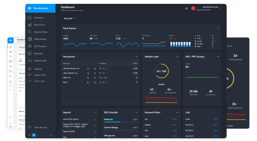
The All-in-One Platform for Effective SEO
Behind every successful business is a strong SEO campaign. But with countless optimization tools and techniques out there to choose from, it can be hard to know where to start. Well, fear no more, cause I've got just the thing to help. Presenting the Ranktracker all-in-one platform for effective SEO
We have finally opened registration to Ranktracker absolutely free!
Create a free accountOr Sign in using your credentials
Why It Matters:
- Improves accessibility and user experience.
- Reduces friction and encourages longer on-page durations.
How to Implement:
- Use at least 16px base font size for body text.
- Test your site on multiple devices to ensure readability.
6. Mobile Page Load Speed (<2 Seconds)
What It Is: Mobile users expect pages to load almost instantly. A load time under two seconds is a good benchmark.
Why It Matters:
- Faster pages reduce bounce rates and improve user satisfaction.
- Page speed is a known ranking factor for mobile searches.
How to Implement:
- Compress and optimize images.
- Minimize JavaScript and CSS, and use caching.
- Consider using a Content Delivery Network (CDN).
7. UX Design Optimized for Thumb-Friendly Interactions
What It Is: Most users hold their phones with one hand and use their thumbs to navigate. Thumb-friendly design places key elements within natural thumb reach.
Why It Matters:
- Improves ease-of-use and reduces user frustration.
- Encourages better engagement and repeat visits.
How to Implement:
- Place important buttons and menus at reachable screen areas (usually bottom corners).
- Ensure sufficient spacing between interactive elements.
8. Mobile Popup Avoidance
What It Is: Mobile popups and intrusive interstitials can block content and frustrate users.
Why It Matters:
- Reduces user annoyance and bounce rates.
- Google has stated that intrusive interstitials can negatively affect mobile rankings.
How to Implement:
- Use non-intrusive banners or inline CTAs.
- If popups are necessary, trigger them after user actions, not immediately on page load.
9. Instant App Links for Mobile SERPs
What It Is: Instant app links enable users who have an app installed to open content directly in the app from search results.
Why It Matters:
- Seamless user journeys between search and app experiences.
- Increases app engagement and satisfaction for existing users.
How to Implement:
- Use app indexing and deep links to connect web content and corresponding app content.
- Follow platform-specific guidelines (Android App Links, iOS Universal Links).
10. Progressive Web App (PWA) Implementation
What It Is: PWAs deliver app-like experiences on mobile web browsers, offering offline capabilities, push notifications, and smooth performance.
Why It Matters:
- Provides a faster, more engaging mobile experience without requiring a full app download.
- Encourages re-engagement and can boost conversion rates.
How to Implement:
- Add a manifest file and service worker.
- Ensure your site meets PWA criteria (HTTPS, fast load times, responsive design).
Conclusion
Optimizing for mobile SEO and page experience involves more than just making your site responsive. Speed, accessibility, navigation ease, and thumb-friendly design all contribute to user satisfaction and higher search rankings. By applying these mobile best practices—from implementing AMP and PWAs to ensuring readable font sizes and minimal intrusive popups—you can create a mobile experience that delights users and earns long-lasting search visibility.
Key Takeaways:
- Ensure responsive design and proper viewport settings for consistent mobile experiences.
- Focus on fast load times, intuitive navigation, and clear, readable text.
- Enhance the user journey with AMP, deep app links, and PWAs for a more engaging, high-performing mobile presence.

