Intro
Buyer hesitation is one of the biggest challenges of ecommerce marketing and sales. Overcoming it can not only improve customer satisfaction but also help you grow your brand.
It’s natural and understandable that a customer would hesitate before spending money or shopping at a new online store. Your ultimate goal is not to eliminate it but rather to anticipate it and overcome it. By showing your customers you understand their needs and qualms, you will begin to build long-lasting relationships with them.
Here’s how you can utilize various design and marketing tactics to overcome buyer hesitation.
Allow Shoppers to Find Their Products Easily
Let’s start with an often-overlooked cause of buyer hesitation: confusion.
If you have a massive inventory of products, it can be difficult for the customer to find exactly what they are looking for. This can be a source of both frustration and an insurmountable conversion obstacle.
Smaller ecommerce websites can be plagued by the same issue too, if their navigation and website search are lackluster and difficult to manage.
The solution is a simple one in theory, but it can be somewhat time-consuming to execute. You’ll need to come up with a more user-friendly interface that enables multiple logical, intuitive, and, above all, simple ways to explore your inventory.
The All-in-One Platform for Effective SEO
Behind every successful business is a strong SEO campaign. But with countless optimization tools and techniques out there to choose from, it can be hard to know where to start. Well, fear no more, cause I've got just the thing to help. Presenting the Ranktracker all-in-one platform for effective SEO
We have finally opened registration to Ranktracker absolutely free!
Create a free accountOr Sign in using your credentials
Try to approach the issue from your customer’s point of view. You understand your stock and know exactly where to find each item. What if you were unfamiliar with product categorizations or category names?
There are numerous solutions you can put in place. Let’s look at Moto Machines as a good example of utilizing numerous UI elements that make search and navigation easier.
They have this great search feature that lets you find parts for your specific motorbike. You just select the make and model, and you’ll be shown a list of all the items that will fit it. This simple element instantly elevates the user experience.
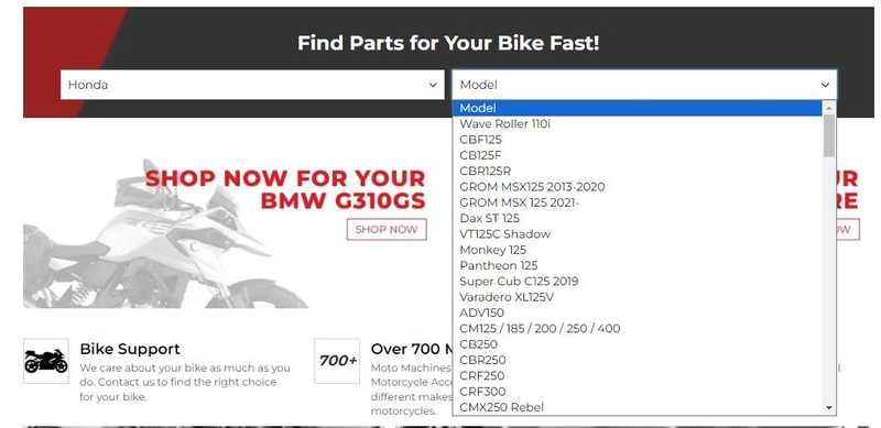
Source: motomachines.com
Their website navigation is top-notch as well. You can search by manufacturer and product type. The subcategory names are clear and easy to understand, and you are bound to find the types of products you need in just a couple of clicks.
The All-in-One Platform for Effective SEO
Behind every successful business is a strong SEO campaign. But with countless optimization tools and techniques out there to choose from, it can be hard to know where to start. Well, fear no more, cause I've got just the thing to help. Presenting the Ranktracker all-in-one platform for effective SEO
We have finally opened registration to Ranktracker absolutely free!
Create a free accountOr Sign in using your credentials
Their search feature is also easy to use. It provides suggestions when you enter a search term, and it also lists out both categories and products that you might want to check out.
Don’t Limit Reviews to Product Pages
Buyers will also hesitate to convert when they are unsure about the quality of a product. High-converting landing pages will thus contain product reviews, which will help a customer overcome their initial qualms and get to know the item better.
A lot of ecommerce brands, however, make the mistake of only featuring product reviews on individual product pages. And while they should certainly be a part of them, they should not be restricted to these pages alone.
Arguably, every page that allows a customer to add a product to their cart should feature product reviews. These valuable trust signals will help inspire trust and boost your brand’s credibility. They will also boost conversion rates.
If you fail to utilize reviews on product category pages, you are missing out on a huge opportunity. Check out this Transparent Labs category page for pre-workout supplements. It features a star rating for every product, which signals to customers that the products have been tried and tested by others and that the majority of them have enjoyed them.
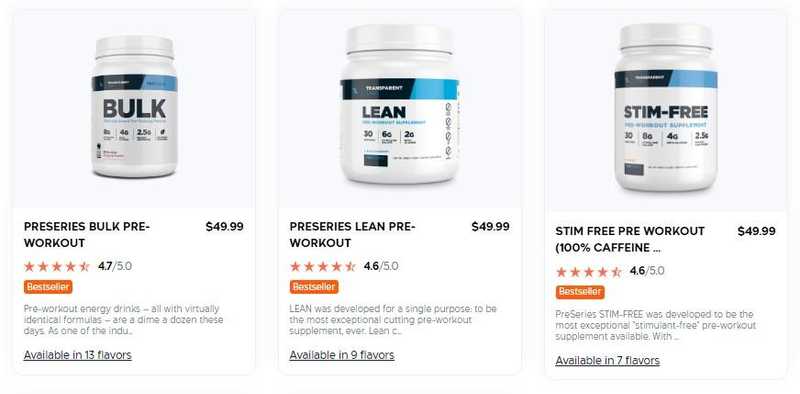
Source: transparentlabs.com
Another way to implement this tactic is with a flyout. This Deseret Biologicals category page features a “reviews” flyout that can serve as a good hook for both product quality and overall website services. It’s unobtrusive so it doesn’t distract from browsing, but it provides a great additional set of information.
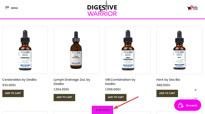
Source: digestivewarrior.com
Present Product Details with Video
Customers may be unwilling to convert for the simple reason of not having enough information about the product they are interested in. The product itself could be complex or something that requires a bit of specialized knowledge. It could be something niche or something you don’t buy often. Or the customer might simply be unfamiliar with the item and its uses and benefits.
When this is the case, a great way to overcome buyer hesitation is to feature a video on the product page. Video marketing allows you to communicate all kinds of messages more clearly and in an easy-to-understand way. It can be used in various campaigns, and it will elevate the quality of any product page.
Consider the nature of the product and the cause for buyer hesitation before you film a video. What information can you provide to boost the likelihood of a conversion? Can you show how the product is used? Can you film customer testimonials and show the results they have achieved? Do you need to demonstrate how the product is assembled?
Understanding your customers’ pain points will help you decide on the right format and length. Check out the video on this bulk citric acid supplier. It tackles numerous conversion obstacles: it addresses the benefits of the product, explains the manufacturing and distribution process and reassures the watcher of its quality. It’s a simple video with a clear marketing message: we know what we are doing, trust us to supply you with a great, reliable, tested product.
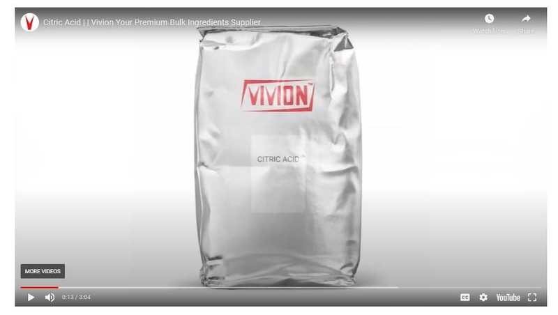
Source: vivion.com
Address Security Concerns Clearly
Website security and data privacy are incredibly common causes of buyer hesitation. Customers know the internet is not exactly a safe place, and they are well aware there are numerous scams out there, trying to bait the careless.
In order to overcome the issue, you will need to first understand what the main concern is. Are shoppers worried whether or not you are a trustworthy, real, reliable brand? Are they concerned about payment security or the privacy of their personal data? Are they worried the product itself might be a hoax?
Once you understand the concern, you can implement trust badges that will reassure customers. They are a very simple and effective tactic that won’t take up too much page real estate.
This golf cart accessories page is a nice example of how you can execute this tactic. They’ve added several trust badges to the top of their page to address the most common conversion obstacles. They provide assurance that payments are safe and secure and that their products are trusted by many.

Source: golfcarttiresupply.com
Ideally, you will want to include at least one third-party trust badge from a reputable website. This will add an extra layer of trust and credibility.
Write a Clear Returns Policy
Shoppers will often hesitate to make a purchase when they are unsure how they can return it. Even if you offer free shipping on all orders or orders above a certain threshold, some customers will worry about the cost and complexity of returning any items they don’t like or that don’t fit them well. This is especially true for clothing items.
In order to overcome this obstacle, all you need to do is write a clear, easy-to-understand, and fair returns policy. You don’t necessarily have to offer free returns. You do need to tell your customers exactly how much a return will cost, what the process is like, and what they can expect to get back, i.e., a full refund or store credit.
Athleta has a great returns and exchanges policy you can use to model your own. They provide clear step-by-step instructions detailing the process for all manner of returns and exchanges. They are also clear about it being free, as long as the prepaid return label is used.
They also have a useful returns FAQ section that addresses other common concerns and reassures the customer that their satisfaction matters.
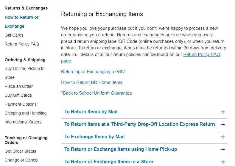
Source: https://athleta.gap.com
Also note how important it is to make the returns and exchanges policy easily accessible from the footer or the main menu. If visitors can’t find it easily, it will be much less impactful and useful.
Answer Common Questions Early
Speaking of frequently asked questions, you can use them to your advantage to overcome a lot of conversion obstacles early on. By preemptively providing answers to what you know a customer is likely to ask, you’ll free up a lot of your customer service team’s time. On top of that, you’ll build trust and a better user experience.
Start by identifying the questions customers want answered. Go to your inbox and chatbot and see what customers tend to wonder about. You can also use our Keyword Finder to identify popular search terms that are related or relevant to your brand, and make sure to incorporate the answers. This tactic can boost your rankings alongside your conversions.
BarkBox has a neat little FAQ section on their homepage that provides short answers to a lot of common concerns. Some of these questions also happen to coincide with the questions customers ask in search engines, which is an added bonus.
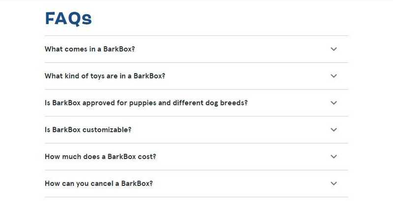
_Source: barkbox.com _
Notice how to the point these answers are. They are not trying to drown their customers in information; they merely provide easy access to information, some of which is already available on the same page. This kind of formatting just makes it easier to find the answers and digest the information.
Highlight the Way You Overcome the Most Common Conversion Obstacles
Sometimes the best tactic is the simplest one. Instead of trying to come up with various clever ways to overcome the most common conversion obstacles, you can just spell them out with one simple, effective element.
Consider this the highlights reel. What is it you want your customers to know about your brand? What kinds of trust signals can you provide? What are the benefits of shopping in your store? What are your current discounts or offers?
When you clearly highlight all of this information in one place, instead of scattering it all over the page, you will instantly attract customer attention. In one glance, they’ll learn more about your brand and have a lot of their concerns addressed.
Greats does this with an animated element at the top of their pages. Since it’s moving, it is guaranteed to be noticed. It spells out the key benefits of conversion: some items are significantly discounted, and there is free shipping available above a certain threshold.
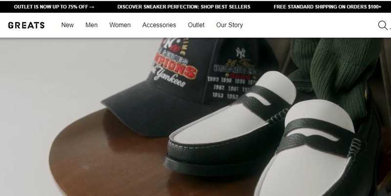
Source: greats.com
The All-in-One Platform for Effective SEO
Behind every successful business is a strong SEO campaign. But with countless optimization tools and techniques out there to choose from, it can be hard to know where to start. Well, fear no more, cause I've got just the thing to help. Presenting the Ranktracker all-in-one platform for effective SEO
We have finally opened registration to Ranktracker absolutely free!
Create a free accountOr Sign in using your credentials
Lords and Labradors do something similar, albeit static. They have focused on showcasing some other benefits: their rating on a trusted third-party website, their mobile app, their customer service contact, and the fact that they are a conscious UK brand.
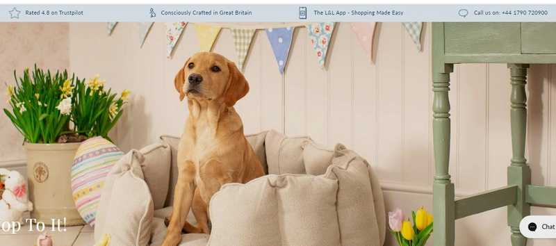
Source: lordsandlabradors.co.uk
Consider which information will sway your customers most. What is it they need to know to trust you and overcome some of their initial hesitation?
Wrapping Up
Consider the main causes of your customers’ hesitation and choose tactics that will address them specifically. Implementing all of the ones we’ve listed will certainly improve both user experience and brand credibility. But to see the best results, start with the ones that will have the biggest impact.

