Intro
In today's digital world, SaaS (Software as a Service) is everywhere, and a good landing page is crucial to success. Think of it as the face of a SaaS product – it's the first thing potential customers see. But it's more than just a webpage; it's a powerful tool to grab attention, give info, turn visitors into leads, and, eventually, pay customers.
This guide will dive deep into what makes a SaaS landing page work. We'll talk about keeping things clear and easy to understand, writing in a way that grabs people, using pictures and videos to draw them in, and making it easy for them to sign up or learn more. We'll show you how to make a landing page that looks great and gets actual results in today's competitive online world.
1. Dominating the Above-the-Fold Section
Tip 1: Craft a Crystal-Clear Value Proposition
Make sure customers grasp your SaaS product's worth right away. Create a brief and persuasive headline that conveys your distinctive selling point. Use words that connect with your desired audience and address their pain points.
Tip 2: Optimize Your Hero Section
The hero section of your landing page (the initial part visitors encounter) should convey your offerings and the advantages for the user.
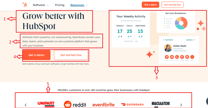
It acts as the initial interaction point for visitors and is pivotal in grabbing their attention and prompting further engagement. Here are the essential elements of a hero section for a SaaS landing page:
The Hero section of a SaaS landing page typically includes the following elements:
- Headline: This is the first piece of content that visitors see.
A bold and compelling headline that communicates the main benefit or solution offered by your SaaS product, what your product does, and why it’s valuable.
A brief supporting statement that provides additional context or elaborates on the headline. It reinforces the value proposition and helps to engage visitors further.
-
Hero Image or Video: An eye-catching image or video that sets the tone for the hero section and enhances visual appeal. It should be relevant to your SaaS product and reinforce the overall message of the landing page. High-quality images or videos that showcase your SaaS product in action or highlight its key features and benefits.
-
Call to Action (CTA): An easily noticeable and action-oriented button that encourages visitors to proceed to the next stage, like registering for a free trial, asking for a demo, or discovering more about the product. The CTA button should stand out visually and be positioned prominently within the hero section.
-
Social Proof: Social proof contributes to establishing trust and credibility. Testimonials, customer logos, or trust badges serve as social proof, enhancing visitor credibility. Examples of satisfied customers or reputable partnerships can foster trust and confidence in your product.
Example: HubSpot Landing Page
Source: HubSpot
The All-in-One Platform for Effective SEO
Behind every successful business is a strong SEO campaign. But with countless optimization tools and techniques out there to choose from, it can be hard to know where to start. Well, fear no more, cause I've got just the thing to help. Presenting the Ranktracker all-in-one platform for effective SEO
We have finally opened registration to Ranktracker absolutely free!
Create a free accountOr Sign in using your credentials
HubSpot’s hero section incorporates all five elements of an effective convertible landing page. The HubSpot Hero section combines clear messaging, engaging visuals, a compelling CTA, benefits-oriented copy, and social proof to create a high-converting landing page.
Remember, the Hero section is the first thing visitors see when they land on your page. So, it’s worth investing time and effort into crafting a powerful and effective Hero section for your SaaS landing page.
By incorporating these essential elements into the hero section of your SaaS landing page, you can effectively capture visitors' attention, communicate the value of your product, and encourage them to take the desired action.
Tip 3: Simplify Navigation for Seamless Experience
Keep the layout and navigation simple. A clutter-free design guides users seamlessly through the page. Use intuitive menus and clear CTAs (Call to Action) to ensure visitors can quickly find the information they want.
A clean, uncluttered navigation bar simplifies the exploration of your site and access to the desired information.
Example: Trello Landing Page
The All-in-One Platform for Effective SEO
Behind every successful business is a strong SEO campaign. But with countless optimization tools and techniques out there to choose from, it can be hard to know where to start. Well, fear no more, cause I've got just the thing to help. Presenting the Ranktracker all-in-one platform for effective SEO
We have finally opened registration to Ranktracker absolutely free!
Create a free accountOr Sign in using your credentials
Source: Trello
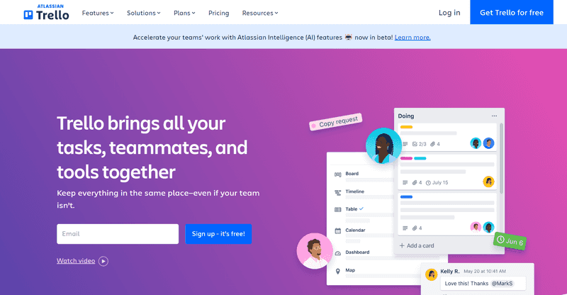
Trello's landing page exemplifies simplicity in navigation. Its neat design and user-friendly layout allow users to quickly grasp the project management tool's capabilities without feeling overwhelmed. Trello's landing page features a straightforward navigation menu, making it easy for users to explore different features and pricing options.
2. Captivating with Visuals
Tip 4: Enhancing with High-Quality Images and Product Videos
Visual content is powerful. Incorporate top-notch images and videos that demonstrate your product's functionality. Use visuals to tell a story about how your SaaS solution solves real customer problems.
Visual content can quickly and effectively communicate how your product works. Consider using screenshots, infographics, or short explainer videos.
Example: Canva Landing Page
Source: Canva
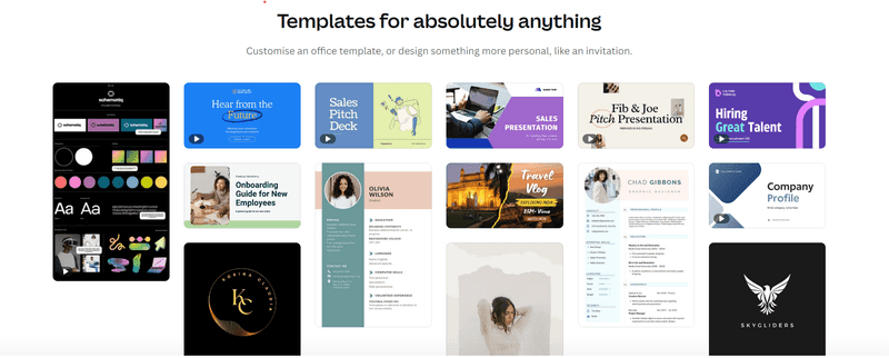
Canva incorporates high-quality images and videos to showcase its design capabilities. The landing page visually demonstrates how users can create stunning graphics effortlessly.
Pro Tip:
- Use product videos to demonstrate key features and benefits, keeping them concise and engaging.
- Incorporate high-quality visuals, including images and product videos, to showcase your SaaS solution effectively.
Tip 5: Adding a Human Touch to Your Brand
Integrate images of your team or customers. Humanizing your brand fosters trust and connection. Real faces and testimonials add authenticity, helping potential customers relate to your product.
Show the people behind your product. This could be photos of your team or testimonials from other real-life customers.
Example: Ahrefs Landing Page
Source: Ahrefs
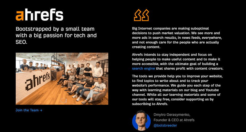
Ahrefs humanizes its brand by featuring team members on its landing page. Real faces create a connection, making the company more relatable and trustworthy. Ahref's landing page incorporates images of its team members, creating a sense of familiarity and trust with potential customers.
Pro Tip:
- Make your landing page feel more personal by including pictures of your team or customers to show your brand's human side and build trust and authenticity.
3. Crafting Compelling Copy
Tip 6: Harnessing Benefit-Oriented Language
Focus on the benefits your SaaS product brings rather than just listing features. Use persuasive language to communicate how your solution can positively impact the customer's business or life.
Example: Dropbox Landing Page
Source: Dropbox
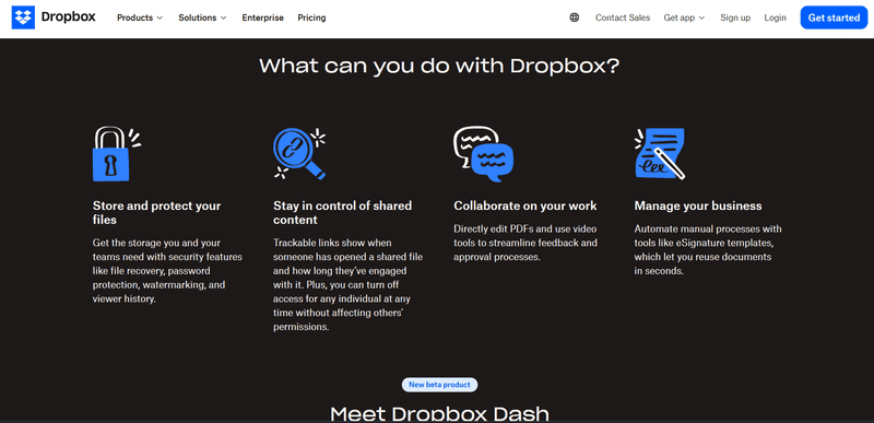
Dropbox's landing page emphasizes benefits with clear headings like: "Store and protect your files," “Stay in control of shared content,” “Collaborate on your work,” and “Manage your business.” The focus is on the user's convenience and accessibility.
Pro Tip:
- Use persuasive language to highlight how your solution addresses specific pain points and improves users' lives or businesses.
- Focus on your SaaS product's benefits rather than just listing features.
Tip 7: Engaging in Customer-Centric Messaging
Craft your copy around the customer's needs and challenges. Use language that resonates with their pain points and emphasizes how your SaaS offering provides the solution they want.
Speak directly to your customer’s needs and desires. Instead of “We offer 24/7 support,” try “Get the help you need, whenever you need it.”
Example: Zoom Landing Page
Source: Zoom
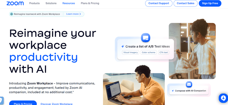
Zoom's copy revolves around the customer's need for seamless video communication. Phrases like "Reimagine your workplace productivity with AI," Reimagine your workplace communication with AI and "Reimagine your workplace engagement with AI" address specific pain points and aspirations.
Pro Tip:
- Craft your message to talk directly to the type of customer you want and clarify how your SaaS product can fix their problems.
- Adjust your writing to connect with the people you want to reach and discuss their needs and problems directly.
4. Building Trust
Tip 8: Displaying Social Proof for Credibility
Feature customer testimonials and case studies prominently. Real-life success stories provide social proof and build trust. Include specifics about customers' challenges and how your SaaS product helped overcome them. Include specific details and results from satisfied customers to demonstrate the tangible benefits of your SaaS solution.
Showcase testimonials, case studies, or logos of well-known companies you’ve worked with to build credibility.
Example: HubSpot Landing Page
Source: HubSpot
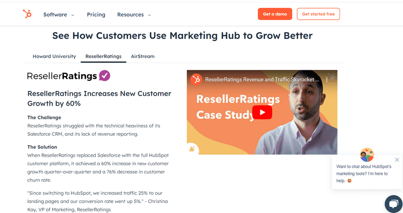
HubSpot strategically places customer testimonials on its landing page. Real-life success stories provide social proof and assure potential customers that they are in capable hands.
Pro Tips:
- Display counts of the Number of Signups to showcase popularity.
- Highlight any Awards from Reputable Organizations.
- Incorporate Customer Testimonials and Reviews to build trust.
- Include Trust Seals for Security to ensure security.
- Show Ratings to indicate quality.
- Feature Case Studies to demonstrate success stories.
- Display Customer Logos or Trust Badges to enhance credibility.
Tip 9: Ensuring Security and Privacy Assurance
Incorporate trust badges, security certifications, and a transparent privacy policy. Addressing potential data security and privacy concerns is crucial, especially in the SaaS industry.
Reassure visitors that their data will be safe with you by displaying security badges and explaining your privacy policies.
Pro Tip:
- Include a brief statement or link to your privacy policy to reassure visitors about protecting their personal information.
- Address potential concerns about data security and privacy by prominently displaying trust badges and security certifications.
5. Ensuring Responsive Design and Performance
Tip 10: Optimizing for Mobile Devices
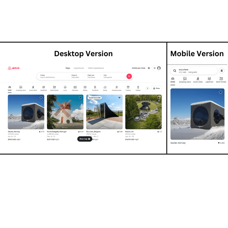
Because so many people use mobile devices to browse the internet, ensure your landing page works well on all screens. A responsive design ensures your site looks good and works smoothly, no matter what device your customers use.
Example: Airbnb Landing Page
Source: Airbnb
Airbnb landing page is optimized for mobile devices, ensuring a seamless user experience. The mobile version retains the key elements and functionality of the desktop version. Airbnb for Work's landing page is fully optimized for mobile devices, providing a consistent and user-friendly experience for visitors on smartphones and tablets.
Pro Tip:
- Try out your landing page on different mobile devices to find and fix any problems with how it looks or works.
- Make sure your landing page works well on mobile devices so that everyone has a smooth experience, no matter what size screen they have.
Tip 11: Ensuring Fast Loading Speed
Optimize page loading speed to prevent user frustration. Compress images, minimize HTTP requests, and utilize caching techniques to ensure swift access to your landing page.
A slow site will lose visitors. Optimize your site’s speed by compressing images, using a content delivery network (CDN), and minimizing CSS and JavaScript.
Based on research by Portent, a website that loads within 1-second experiences a conversion rate three times higher than a website that takes 5 seconds to load.
6. Facilitating User-Friendly Conversion
Tip 12: Simplifying Forms for Seamless Submission
If your landing page has a sign-up or contact form, ensure it's concise and straightforward. Reduce the number of fields to streamline the process and minimize any obstacles to conversion.
Make form completion effortless for visitors by requesting only essential information.
According to a survey by HubSpot, "30.7% of marketers believe that the optimal number of questions on a landing page form for maximizing conversions is four."
Pro Tip:
- Only ask for essential information and use autofill features to streamline the form completion process.
- Keep signup or contact forms short and straightforward to reduce friction and make the conversion process as smooth as possible.
Tip 13: Guiding with Clear Call-to-Actions (CTAs)
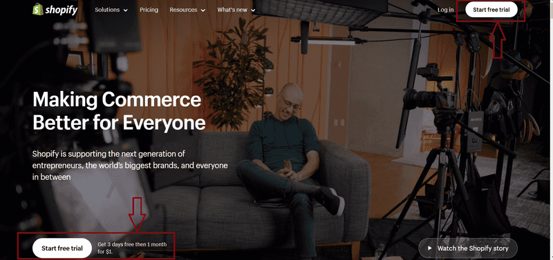
Ensure your Call to Action stands out, is persuasive, and is easily visible. Utilize language that prompts action, and explore A/B testing to discover the most impactful CTA for your audience.
Your call to action should communicate the outcome upon clicking.
According to HubSpot, "Personalized CTAs generate a 202% higher conversion rate than standard versions."
Example: Shopify Landing Page
Source: Shopify
Shopify's landing page features a clear CTA with action-oriented language: "Start free trial." The emphasis is on inviting users to take the first step, making it a compelling and straightforward call to action. Shopify's landing page features clear CTAs with action-oriented language, inviting visitors to start their free trial or learn more about their e-commerce platform.
Pro Tip:
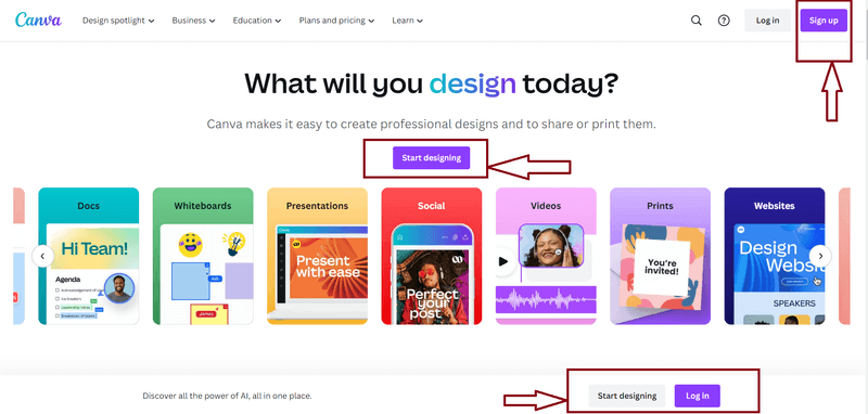
- Simple and Short, concise CTAs, such as "Sign Up Free," exemplify simplicity and clarity.
- Attention-Grabbing
Example: Canva's vibrant colors and compelling language in its CTAs captivate attention.
Source: Canav
- Target Audience-Focused to specific user segments, ensuring relevance and resonance.
- A/B Tested CTAs to optimize for the highest conversion rates.
Tip 14: Enhancing Engagement with Live Chat Support
Live chat support can help answer visitors’ questions quickly, increasing their conversion chances.
According to statistics from KlientBoost's landing page, incorporating live chat can result in a 20% conversion boost.
7. Analyzing and Iterating
Tip 15: Implementing Advanced Analytics Tools
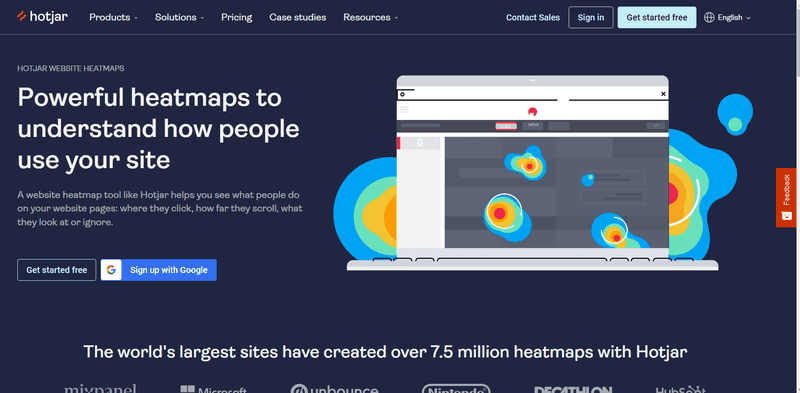
Integrate analytics tools to track user behavior on your landing page. Analyze data to understand user interactions, identify drop-off points, and make data-driven improvements.
Use tools like Google Analytics to monitor visitor interactions and continually enhance your site.
Example: Hotjar
Source: Hotjar
The All-in-One Platform for Effective SEO
Behind every successful business is a strong SEO campaign. But with countless optimization tools and techniques out there to choose from, it can be hard to know where to start. Well, fear no more, cause I've got just the thing to help. Presenting the Ranktracker all-in-one platform for effective SEO
We have finally opened registration to Ranktracker absolutely free!
Create a free accountOr Sign in using your credentials
Hotjar provides analytics tools that help businesses understand user behavior. Heatmaps and session recordings enable continuous improvement based on real-time insights. Hotjar provides heatmaps and session recordings of visual representations of user interactions with your landing page, helping you identify areas for optimization.
Pro Tip:
- Utilize tools like Google Analytics or Hotjar to track metrics like bounce rate, conversion rate, and user engagement.
- Integrate analytics tools to track user behavior and gain insights for iterative enhancements to your landing page.
Tip 16: Refining Through A/B Testing
Consistently experiment with various elements of your landing page, including headlines, visuals, CTAs, and forms. A/B testing is instrumental in pinpointing which aspects resonate most effectively with your audience and improves conversion rates.
Regularly experiment with different versions of your landing page to discover optimal performance. Adjust one element at a time, such as the headline or CTA, to know the cause of any changes.
Conclusion
Creating a high-converting SaaS page involves clear and straightforward design, engaging visuals, compelling copywriting, trust-building elements, responsive design, a user-friendly conversion process, and ongoing testing and improvement. By following these tips and always keeping your customer’s needs in mind, you can create a landing page that attracts and converts.
Remember, the best landing pages are constantly evolving. Keep testing, keep iterating, and keep improving. Good luck!

